Rothy’s
Rothy's champions sustainable fashion by transforming plastic water bottles into women’s and men’s shoes, bags, and accessories. As a Graphic Designer, I collaborated with the digital growth team to integrate a beautiful, on-brand visual experience with strategic marketing initiatives.
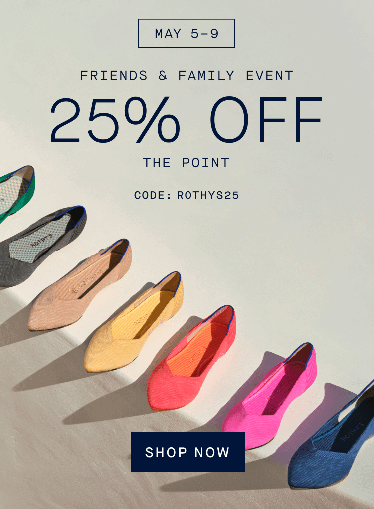
2023 Friends & Family Event
Problem: In May 2023, Rothy’s held a weeklong event offering 25% off select women’s and men’s styles. I was tasked with building a visual identity for this event that was both connected to the overarching Rothy’s brand, but was also easily differentiated and scalable onto all digital and print platforms.
Solution: I built a type lockup that would served as the identity of the Friends & Family Event, appearing on all marketing platforms including the Rothy’s homepage, webpages, emails, paid ads, social media, and print mailers. The event was so successful that the team decided to further extend the event another three days, visually represented by a secondary lockup that I developed as well. The results of the campaign are as follows:
Total sales: $17.6 million (surpassed projected total sales by $5.2 million)
Orders: 110,355 (surpassed projected orders by 25,437)

Event Lockup

Extended Event Lockup

Desktop Homepage Banner
Mobile Homepage Banner

Women’s Points Landing Page

Men’s Landing Page

Event Launch Email
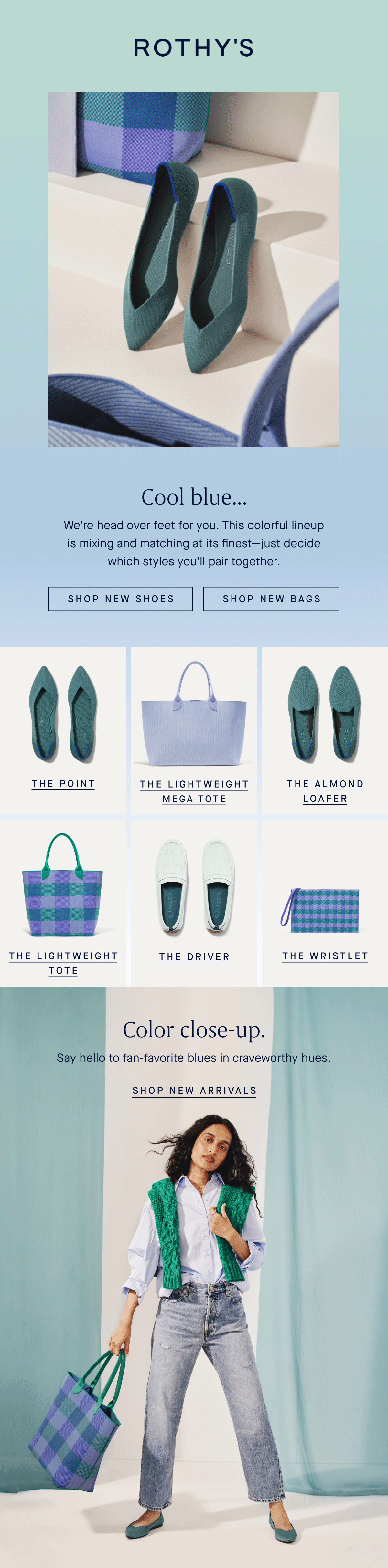
Rothy’s Email Design
Problem: As one of the largest sales drivers for our company, the email channel requires a high level of visual appeal and targeted strategy encourage users to both purchase product and build brand loyalty.
Solution: I creative spearheaded 10-12 weekly emails sent out to various customer segmentations. Each email varies in purpose, ranging from announcing a new product launch, teasing the upcoming release of a new shoe color, or encouraging folks to explore products in their favorite colors. Before publishing each send, my team and I ensure the following:
The email is visually on-brand. Each email must look and feel like the Rothy’s brand. To accomplish this goal, I developed a visual style-guide that lays out the typography, colors, padding, and other visual guidelines that ensure unity between all email creatives.
The email is strategic. The creative must tell a story that brings the customer closer to the brand and drives sales.
The email pushes boundaries (sometimes). I am always on the lookout to push the confines of our creative guidelines in ways that elevate brand experience for my customer—I love to explore how to connect with my audience in new ways!