
Quility: Design System
Quility provides affordable, customized insurance and financial planning to help clients protect their futures. As a Senior UI/UX Designer, I lead our design system strategy, overseeing the Figma architecture and component governance to ensure a unified product experience.
Problem: When I audited our existing component library, I found that we had a fundamental usability crisis with parts that didn't meet modern web standards or basic accessibility requirements, creating a disjointing and inconsistent experience. I focused the rebuild on solving three core issues:
Inaccessibility: Most of the design system was behind on WCAG standards. Most of the core UI, like buttons, labels, and alerts, failed basic color contrast checks and minimum tap surface requirements.
Lack of interaction states: Almost all existing components lacked visual feedback like hover and pressed states, making users unsure if an element was clickable or if the system had registered their input.
Inconsistent component appearance and usage: Because we lacked a single source of truth, the same component appeared differently across the platform due to developers having to write custom code for each instance, creating a technical debt and a disjointed user experience.

Inconsistent buttons

Inconsistent text fields
Solution: I rebuilt our design system from scratch to build one that has an accessible-first foundation, to ensure that every component was inclusive, consistent, and easily scaled. I baked accessibility and interactivity into the components as a priority, not as an afterthought.
Redefined color tokens, type scales, and tap surfaces to meet WCAG 2.1 AAA standards, applying them to all components to reduce user frustration.
Built a full suite of component states (Default, Hover, Active, Focus, Disabled) to provide clear, real-time feedback to the user.
Consolidated several versions of a single component into one master component with flexible variants.
Interactive component showcase below: Explore some flexible variants and property logic used throughout the library.
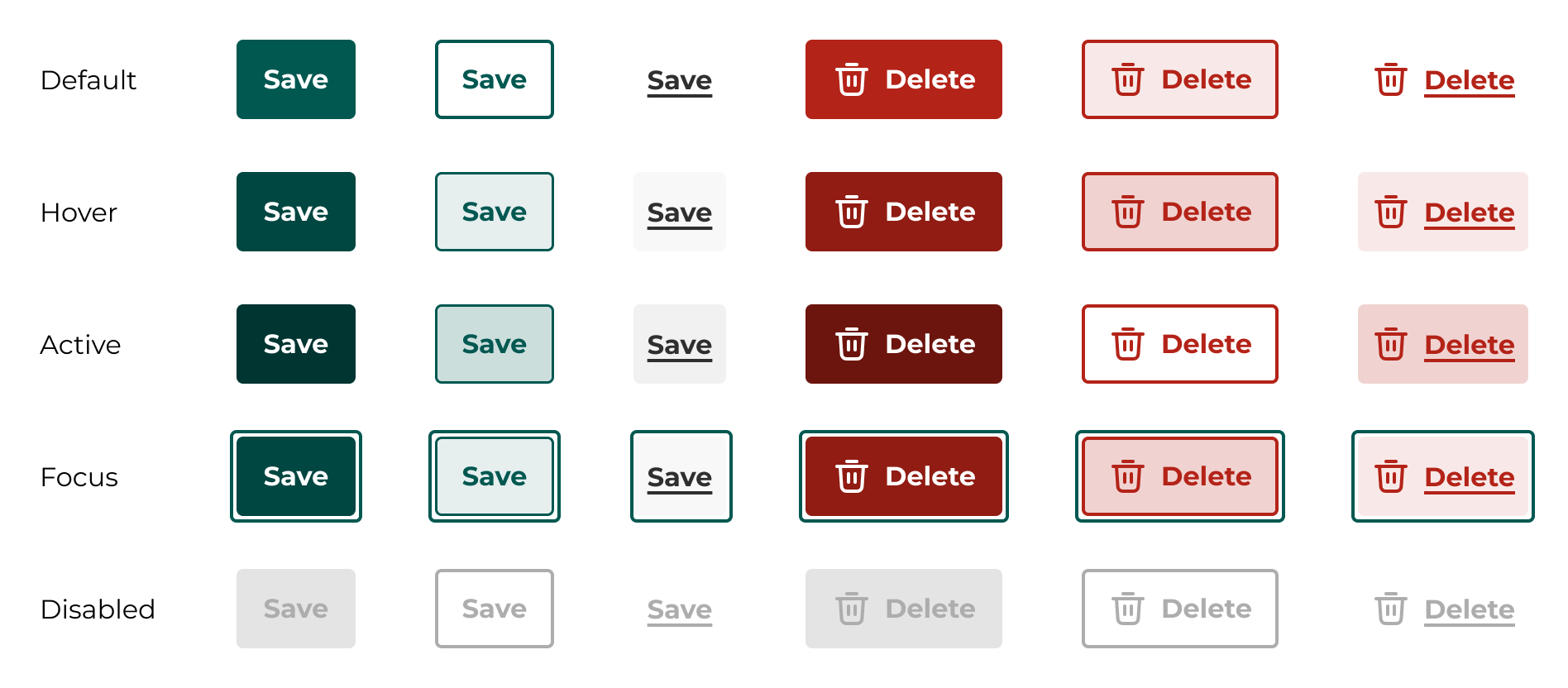
Buttons
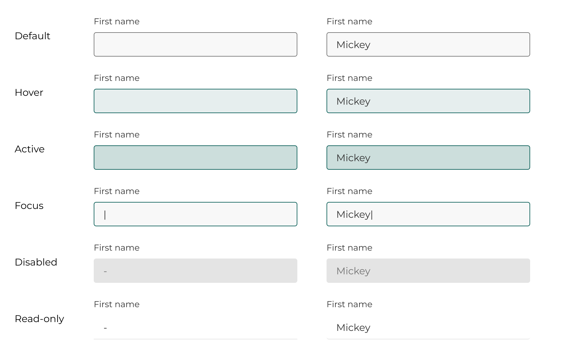
Text fields