BetterHelp UI Design
BetterHelp is the world’s largest therapy platform that aims to make professional therapy accessible, affordable, and convenient. As a Visual Designer on the Product Team, I built and maintained the brand’s visual system and features while resolving critical user needs.
UI Design: Group Sessions
Problem: My team and I were tasked with building a group therapy experience that flowed seamlessly and intuitively with the BetterHelp product to improve client feedback and retention.
Solution: Our goals for building Group Sessions were:
Make group sessions feel balanced. The group therapy experience should be was distinguishable from individual sessions so that clients feel excited to explore the new feature, but still integrate seamlessly into the BetterHelp experience.
Make group sessions intuitive and attractive. Users should be able to easily navigate this experience with little friction, and each design decision should be attractive and intentional.
See statistically significant lifts in one or more of the following categories: client feedback, client conversion, client and therapist retention, live session usage, and group therapy usage.


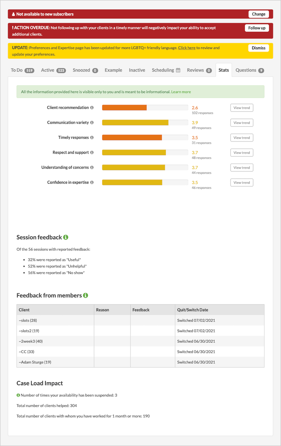
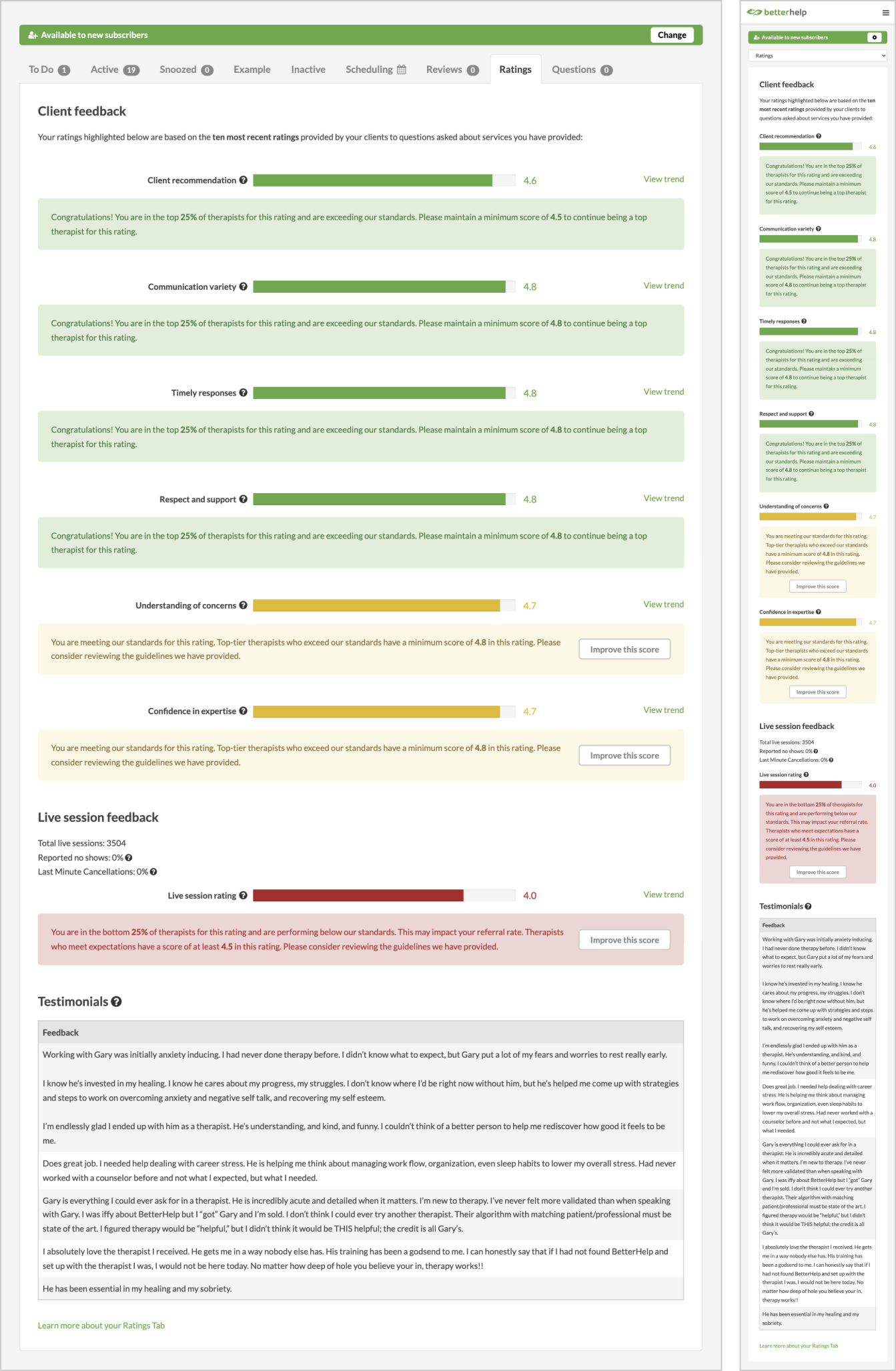
UI Design: Ratings Tab
Problem: Our product previously included a Ratings Tab, where therapists could view how their clients rated their effectiveness in various categories. However, we received user feedback that this page was unhelpful, confusing, and generally unattractive.
Solution: My goals for the Ratings Tab were to:
Make the Ratings Tab user-centered. If I am a therapist looking at this page, can I understand what is happening at a glance? Does the product help guide me to improve in certain areas? Can I easily find information about where this data is gathered, and why it is relevant to me?
Make the Ratings Tab attractive. Taking the original design, we studied similar UI/UX patterns and brainstormed how to communicate the information in ways that are not only functional, but also intentional and pleasant to the eye.
Disclaimer: These images are the property of Compile Inc. and Teladoc Health Inc. They cannot be recreated, downloaded, copied, linked to, or edited in any manner or form for any commercial use without the express written permission of Compile Inc. or Teladoc Health Inc.